Category: Uncategorized

  • How Custom Napkins Are Printed: Colors, Coverage, and Embossing

    How Custom Napkins Are Printed: Colors, Coverage, and Embossing

    A custom napkin looks like the simplest print job on the table, and that is exactly why so many designs disappoint in person. The logo that looked crisp on screen prints soft, the deep navy comes out patchy, and the second ink color sits a hair off from the first. None of this is bad luck; it is the predictable result of printing on tissue, a material that behaves nothing like the coated stock a logo was designed for. Understanding how napkins are actually printed is the difference between artwork that survives the press and artwork that fights it.

    Why tissue is a difficult surface

    Napkin printing is dominated by flexography, a method that transfers ink from a raised, flexible plate as a continuous web of tissue runs through the press. It is fast and economical at the volumes napkins are ordered in, but the substrate sets the limits. Napkin tissue is soft and thin, so tension across the web is hard to hold; too little or too much and the sheet wrinkles, wanders, or tears mid-run. That web movement is the root cause of registration trouble, because every ink color is laid down by a separate plate and the sheet has to line up identically under each one. On stable coated paper this is routine; on drifting tissue, tight multi-color registration is a real constraint rather than a given.

    The second problem is absorbency. Tissue drinks ink far more readily than coated paper or film, so an area meant to read as a solid, even block can come out blotchy, too dark, or uneven if ink transfer is not carefully controlled. This is why heavy coverage and large solid fills are the hardest thing to print well on a napkin, and why designs built for the medium lean on line work and open space rather than flooding the sheet with color.

    How color counts drive the job

    Because each ink is a separate plate and station on the press, the number of colors is the single biggest lever on cost and complexity. A simple logo in one or two colors is the workhorse napkin job: fast to set up, forgiving on registration, and clean on tissue. Every additional color adds a plate, a station, and one more layer that has to register against the others, so a four-color design is not just pricier but mechanically harder to hold in alignment across a long run. Napkin printers typically match to spot or Pantone colors rather than building tones from process color, which keeps each ink solid and predictable instead of relying on fine dot patterns that tissue tends to blur. The practical takeaway is to design in as few flat colors as the brand allows, and to treat each extra ink as a real decision rather than a free upgrade.

    Water-based inks are the norm here, chosen for hygiene and environmental reasons since the napkin touches hands and mouths. That is a point worth confirming with any supplier, because food-contact suitability is a spec, not an assumption.

    Design for the fold, not the flat

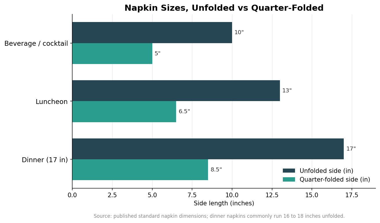
    The mistake that undoes otherwise good artwork is designing for the napkin unfolded when almost nobody ever sees it that way. Standard sizes are well established: a beverage or cocktail napkin is about 10 by 10 inches flat, a luncheon napkin around 13 by 13 inches, and a dinner napkin commonly 16 to 18 inches square, with some running as large as 22 inches. The chart below shows those flat sizes against their quarter-folded footprint.
    Grouped horizontal bar chart of napkin sizes showing unfolded and quarter-folded side length for beverage, luncheon, and dinner napkins
    Standard napkin sizes flat and quarter-folded, in inches.

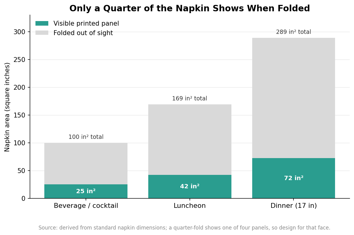
    Quarter-folded, each napkin shows just one of its four panels, which means only a quarter of the total surface is ever on display at a time. A 17-inch dinner napkin has 289 square inches of material but presents roughly 72 square inches on the visible face; the rest is folded away. The chart below makes the point directly.
    Stacked bar chart showing the visible quarter-fold printed panel versus the folded-away area for beverage, luncheon, and dinner napkins
    A quarter-fold shows only one panel, so design for the face that stays visible.

    Design the visible panel, not the whole sheet. Place the logo or message so it lands cleanly on the face that shows after folding, keep it clear of the fold lines, and resist the urge to fill the flat sheet with a pattern most guests will never see. This also saves money, because concentrating ink on one panel avoids paying to print areas that stay hidden. If the napkin will be displayed differently, for example fanned in a glass or laid flat under cutlery, confirm which panel faces out before finalizing placement.

    Embossing and the finishing options

    Printing is not the only way to brand a napkin, and the site’s own specialty, embossing, works on a different principle entirely. Embossing presses a raised or recessed pattern into the tissue rather than laying down ink, so it reads as texture and shadow instead of color. It sidesteps the absorbency and registration issues of printing because there is no ink to blur or misalign, and it gives a tactile, understated look that suits premium and monochrome branding. It also has limits: embossing cannot reproduce fine typographic detail or multiple colors, so it complements printing rather than replacing it. Many napkins combine the two, a printed logo with an embossed border or texture, to get both color and feel.

    Ply sits underneath all of this. Napkins commonly run from a single ply up to two or three plies, and heavier constructions carry ink and embossing better while feeling more substantial in the hand; treat the exact ply as a spec to confirm against a sample rather than a number to assume. When you request a proof, judge it on a real napkin rather than a screen, because the only reliable test of how ink and emboss behave on tissue is to see them on the tissue itself.

    Put together, the method dictates the design. Keep colors few and flat, respect that tissue blurs heavy coverage and fine detail, lay the artwork out for the folded panel that actually shows, and use embossing where texture serves the brand better than ink. Specify the napkin around how it prints, and the finished product matches the proof instead of fighting it.
  • Where to Put a Logo on a Dinner Napkin (Not the Middle)

    This is the single most common and most expensive mistake in napkin print, and it is entirely mechanical.

    What the fold actually does

    A dinner napkin is printed flat and folded into eighths for service. Only one of those eight panels faces up on the plate. Everything printed on the other seven is inside the fold, and the guest never sees it.

    So a logo centred on the flat sheet — which is where a designer will naturally put it, and where it looks best on a proof — ends up tucked into the fold. The venue pays for print nobody looks at.

    Proof folded, never flat

    A flat proof will always look better and approve faster. Ask for the mockup shown folded, at real size, on a plate. If a supplier only ever sends you a flat sheet, that is the warning sign.

    It is worth physically folding a printed sample into eighths yourself before signing off a large run. Thirty seconds, and it has caught orders for us.

    Corner or centre-panel?

    Corner placement is traditional and reads as restrained. Centre-of-panel reads as branding and is harder to miss.

    For a house mark that should feel like part of the table setting, go corner. For an event where the point is that people notice the name, go centre-panel and size it up.

    Watch the fold direction

    Not every folder folds the same way, so the visible panel is not always the same corner of the sheet. We set artwork to our own folder and mark the orientation on the case. If you switch supplier, re-proof rather than assuming the file still works.

  • Pre-Rolled Cutlery Napkins: The Labour Nobody Budgets For

    Rolling cutlery is the job nobody schedules and everybody ends up doing at four in the afternoon.

    The actual cost

    At banquet scale it is several hours of staff time before every single service. It never appears as a line in a budget because it is absorbed into shifts, which is exactly why it goes unexamined for years.

    Pre-rolled sets arrive banded and packed by the case in service quantities. The covers get set; nobody rolls anything.

    The band is the branding

    Once a napkin is rolled, the band is the only part still visible on the table. That is where the mark has to go — printing the napkin itself is spending money on a surface that is now on the inside of a roll.

    What we need from you

    The cutlery pattern, or at minimum the piece count and handle length. A roll specified for slim modern flatware will not close around a heavy hotel pattern, and a band sized for four pieces hangs slack around three.

    Send a photo of an existing roll if you have one. It answers all of this in one go.

    Consistency is the quiet benefit

    Hand-rolled cutlery varies by whoever is on shift, and a table of visibly different rolls reads as sloppy even when nobody can say why. Machine-rolled sets are identical, every cover, every service.

  • Airlaid or Tissue? What Guests Actually Notice

    These are two different materials, not two grades of the same one, and they behave differently in the hand.

    3-ply tissue

    Pressed fibre, in three bonded layers. It is what most dinner service runs on, it prints cleanly, and at 3-ply it has enough substance that nobody thinks about it — which is the goal.

    Two-ply is a false economy at dinner. It feels thin the first time a guest actually uses it, and that impression attaches to the venue rather than to the napkin supplier.

    Airlaid

    Bonded rather than pressed, which gives a soft, slightly textured sheet with the weight and drape of laundered cloth. It falls over a lap instead of crumpling and holds a crease the way linen does.

    Guests routinely assume it is real linen, which is precisely why upscale restaurants and wedding caterers buy it when a laundry contract stops making sense — especially for one-off events where cloth has to be hired, counted and returned.

    How print differs between them

    Airlaid’s texture softens very fine linework, so a hairline mark that reads crisply on tissue can go slightly mushy. It usually just needs a little weight adding to the strokes.

    Foil and emboss, conversely, both look better on airlaid, because there is more substance for the die to press into.

    Choosing between them

    Daily covers at volume: 3-ply tissue. A tasting menu, a wedding, a table that will be photographed: airlaid. Plenty of venues buy both and use the airlaid only in the function room.

  • How to Choose Custom Dinner Napkins: Size, Material & Ply by Setting

    How to Choose Custom Dinner Napkins: Size, Material & Ply by Setting

    Custom dinner napkins look like a simple order—pick a color, drop in a logo, done—until the box arrives and the napkins are too small for the table, too flimsy for the food, or printed with ink smeared across the part that touches a guest’s mouth. Getting it right means matching four decisions to how the napkin will actually be used: size, material, weight, and how your brand goes onto the cloth or paper. Here is how to work through those choices by setting, so the napkin you order is the napkin the moment calls for.

    Start with size, because size signals the setting

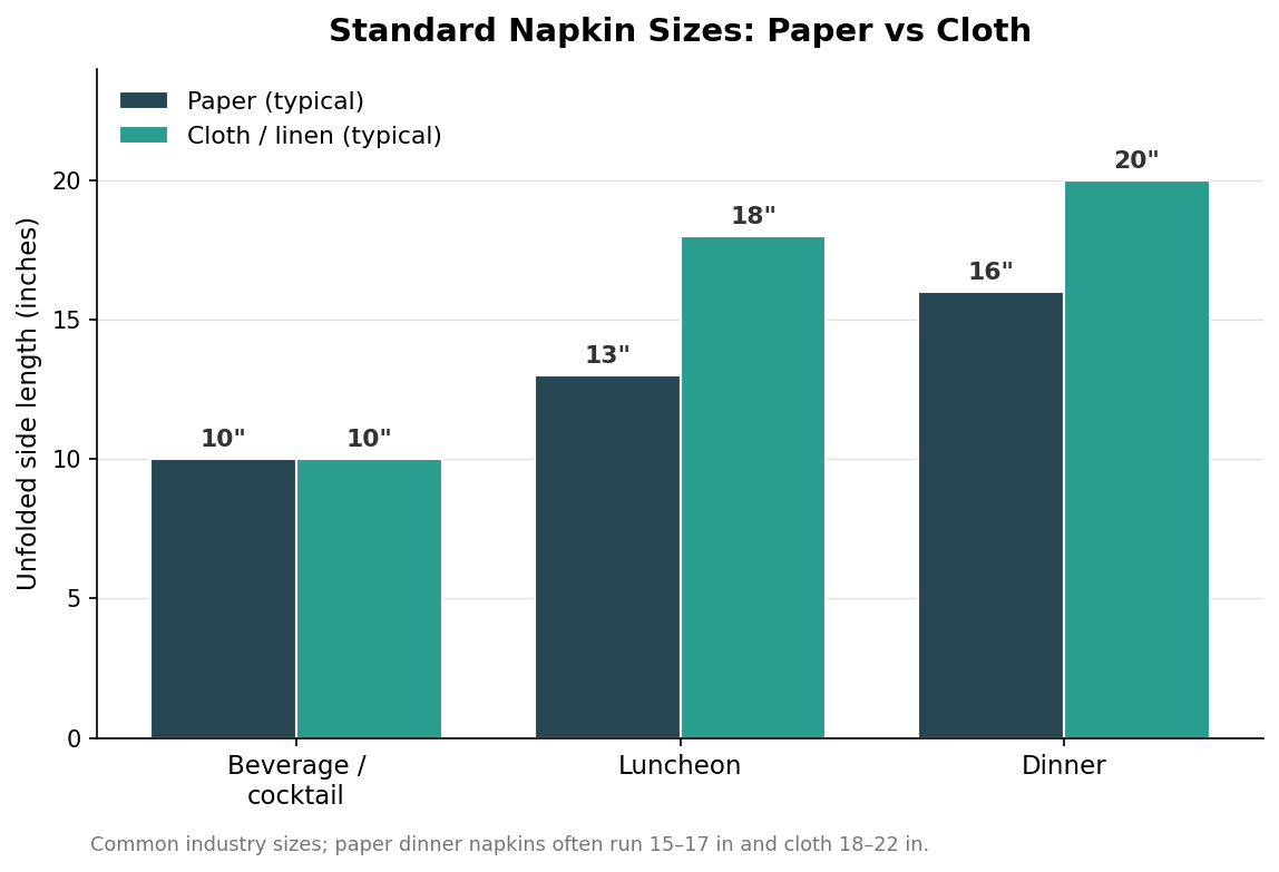
    Napkins are sold by their unfolded, flat dimension, not the folded size you see on the table, and the standard sizes line up closely with occasions. A beverage or cocktail napkin is small, meant to wrap a glass or hold a single passed bite. A luncheon napkin is a mid-size everyday option. A dinner napkin is the largest, sized to drape a lap through a full meal. Getting the size right is the difference between a napkin that reads as generous and one that reads as an afterthought.

    Grouped bar chart of unfolded napkin side length in inches: beverage 10 paper and cloth, luncheon 13 paper and 18 cloth, dinner 16 paper and 20 cloth
    Standard napkin sizes by occasion, with cloth generally running larger than paper for the same setting.

    Paper and cloth run to slightly different standards, with cloth generally larger for the same occasion because it is meant to be seen and reused. For a proper dinner setting, a cloth napkin around 20 inches square feels substantial, while paper dinner napkins commonly run 15 to 17 inches. If you are unsure, size up rather than down; an oversized napkin looks intentional, while an undersized one looks like a cost cut.

    Paper or cloth: matching material to service

    Cloth is the choice when the napkin is part of the table’s impression—fine dining, weddings, banquets, any setting where guests linger and the linen is meant to be noticed and laundered afterward. Cotton and polyester-cotton blends dominate here, with pure cotton feeling the most premium and poly blends resisting wrinkles and stains better through repeated washing. Paper is the choice when speed, hygiene, and disposability matter: cafes, quick-service, catering, delivery, and high-volume events where laundering hundreds of cloths is impractical. Paper is also where custom printing gets economical at volume, because you are decorating a single-use surface rather than something that has to survive a wash cycle. Neither is objectively better; they answer different questions about how the meal is served and cleaned up.

    Ply, weight, and how the napkin feels in hand

    On paper napkins, ply is the thickness lever. Single-ply is thin and economical, suited to dispensers and quick-service counters where a napkin is grabbed and tossed. Two-ply is the casual-dining workhorse, with enough substance to feel decent without much cost. Three-ply reads as premium and is worth it for dinner service or events where the napkin is part of the experience. More plies mean more absorbency and a more cloth-like hand, but also more cost per napkin, so match the ply to how messy the food is and how much the napkin is meant to impress.

    On cloth, the equivalent lever is fabric weight and weave. A heavier, tightly woven napkin drapes better, resists show-through, and survives more launderings, which is why hospitality-grade linens skew heavier than what you would buy for a home drawer. If a supplier quotes a fabric weight, treat a higher number as a proxy for durability and a more luxurious drape, and ask for a swatch before committing to a large run.

    How many to order: planning by the guest

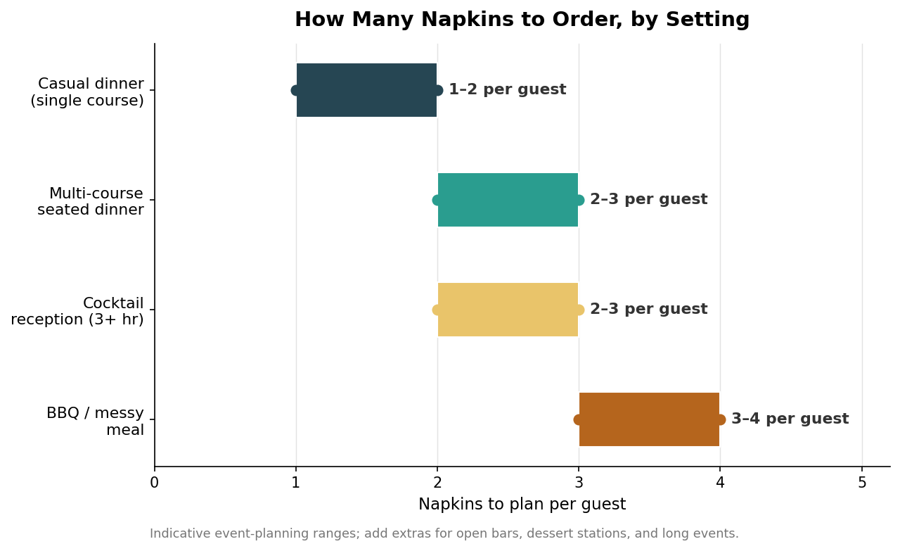
    Under-ordering napkins is the most common and most avoidable mistake, because people plan one per guest and then watch the supply vanish. Guests use more than one, and messier or longer events push the count up fast.

    Horizontal range chart of napkins to plan per guest: casual dinner 1 to 2, multi-course dinner 2 to 3, cocktail reception 2 to 3, BBQ or messy meal 3 to 4
    Plan napkins per guest by setting, then add extras for bars, dessert stations, and long events.

    Use these as planning ranges rather than exact rules, and layer on extras for the things that drive consumption: an open bar, passed appetizers, a dessert station, or an event that runs past a few hours all add roughly one more napkin per guest. For a reception that flows into a seated dinner, plan cocktail napkins for the standing portion and dinner napkins for the table separately, since guests will use both. Ordering a comfortable surplus is cheap insurance; running out mid-event is not a mistake you can fix on the spot.

    Printing your brand without wrecking the napkin

    How you decorate the napkin should follow the material. On paper, a one- or two-color print is the economical standard and reproduces a clean logo well at low minimums; foil or hot-stamp treatments add a premium metallic look for weddings and upscale events at higher cost; full-color process printing is possible but pushes minimums and price up, so reserve it for designs that genuinely need it. Keep meaningful artwork toward a corner or edge rather than the dead center, both because the center is where a folded napkin creases and because it is the part most likely to touch food or a guest’s mouth. On cloth, embroidery gives a durable, tactile, upscale mark that survives laundering, while printing on fabric allows larger full-color designs but needs to be specified for wash durability. Whatever the method, request a proof and confirm exact brand colors before the run, because a color that drifts on a napkin is multiplied across every table.

    Choosing the right napkin for your setting

    Pull it together by working backward from the occasion. A fine-dining restaurant or wedding wants cloth dinner napkins around 20 inches, in cotton or a quality blend, with an embroidered or discreetly printed mark. A casual restaurant or cafe is well served by two-ply paper luncheon or dinner napkins with a simple one- or two-color logo. A quick-service or delivery operation leans on single- or two-ply paper sized to the food, printed economically, and ordered in volume. A cocktail reception needs small beverage napkins in quantity, planned generously per guest. And a catering or banquet program often mixes sizes—beverage napkins for the reception, dinner napkins for the meal—so plan each separately. Nail the size and material to the setting first, then let ply, weight, and print method follow, and the finished napkin will do exactly what you hired it to do.