A custom napkin looks like the simplest print job on the table, and that is exactly why so many designs disappoint in person. The logo that looked crisp on screen prints soft, the deep navy comes out patchy, and the second ink color sits a hair off from the first. None of this is bad luck; it is the predictable result of printing on tissue, a material that behaves nothing like the coated stock a logo was designed for. Understanding how napkins are actually printed is the difference between artwork that survives the press and artwork that fights it.
Why tissue is a difficult surface
Napkin printing is dominated by flexography, a method that transfers ink from a raised, flexible plate as a continuous web of tissue runs through the press. It is fast and economical at the volumes napkins are ordered in, but the substrate sets the limits. Napkin tissue is soft and thin, so tension across the web is hard to hold; too little or too much and the sheet wrinkles, wanders, or tears mid-run. That web movement is the root cause of registration trouble, because every ink color is laid down by a separate plate and the sheet has to line up identically under each one. On stable coated paper this is routine; on drifting tissue, tight multi-color registration is a real constraint rather than a given.
The second problem is absorbency. Tissue drinks ink far more readily than coated paper or film, so an area meant to read as a solid, even block can come out blotchy, too dark, or uneven if ink transfer is not carefully controlled. This is why heavy coverage and large solid fills are the hardest thing to print well on a napkin, and why designs built for the medium lean on line work and open space rather than flooding the sheet with color.
How color counts drive the job
Because each ink is a separate plate and station on the press, the number of colors is the single biggest lever on cost and complexity. A simple logo in one or two colors is the workhorse napkin job: fast to set up, forgiving on registration, and clean on tissue. Every additional color adds a plate, a station, and one more layer that has to register against the others, so a four-color design is not just pricier but mechanically harder to hold in alignment across a long run. Napkin printers typically match to spot or Pantone colors rather than building tones from process color, which keeps each ink solid and predictable instead of relying on fine dot patterns that tissue tends to blur. The practical takeaway is to design in as few flat colors as the brand allows, and to treat each extra ink as a real decision rather than a free upgrade.
Water-based inks are the norm here, chosen for hygiene and environmental reasons since the napkin touches hands and mouths. That is a point worth confirming with any supplier, because food-contact suitability is a spec, not an assumption.
Design for the fold, not the flat
The mistake that undoes otherwise good artwork is designing for the napkin unfolded when almost nobody ever sees it that way. Standard sizes are well established: a beverage or cocktail napkin is about 10 by 10 inches flat, a luncheon napkin around 13 by 13 inches, and a dinner napkin commonly 16 to 18 inches square, with some running as large as 22 inches. The chart below shows those flat sizes against their quarter-folded footprint.
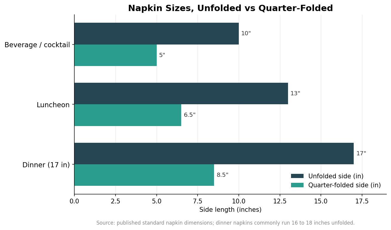
Quarter-folded, each napkin shows just one of its four panels, which means only a quarter of the total surface is ever on display at a time. A 17-inch dinner napkin has 289 square inches of material but presents roughly 72 square inches on the visible face; the rest is folded away. The chart below makes the point directly.
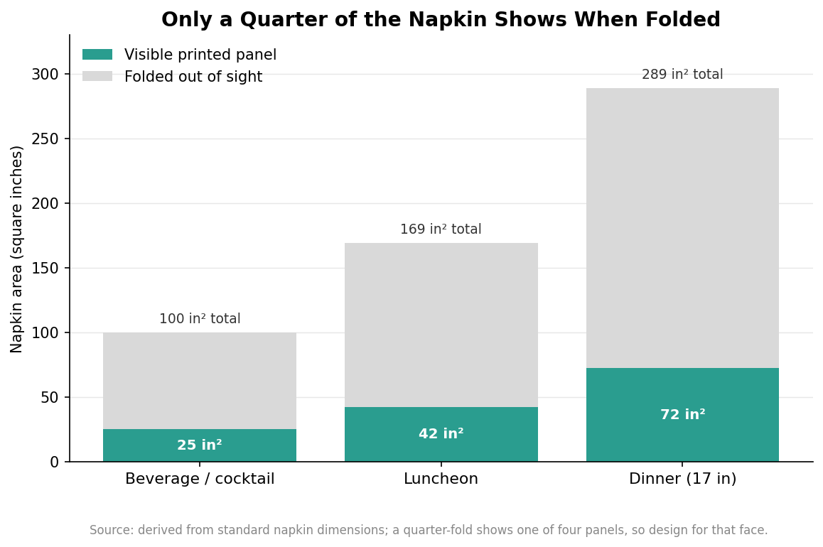
Design the visible panel, not the whole sheet. Place the logo or message so it lands cleanly on the face that shows after folding, keep it clear of the fold lines, and resist the urge to fill the flat sheet with a pattern most guests will never see. This also saves money, because concentrating ink on one panel avoids paying to print areas that stay hidden. If the napkin will be displayed differently, for example fanned in a glass or laid flat under cutlery, confirm which panel faces out before finalizing placement.
Embossing and the finishing options
Printing is not the only way to brand a napkin, and the site’s own specialty, embossing, works on a different principle entirely. Embossing presses a raised or recessed pattern into the tissue rather than laying down ink, so it reads as texture and shadow instead of color. It sidesteps the absorbency and registration issues of printing because there is no ink to blur or misalign, and it gives a tactile, understated look that suits premium and monochrome branding. It also has limits: embossing cannot reproduce fine typographic detail or multiple colors, so it complements printing rather than replacing it. Many napkins combine the two, a printed logo with an embossed border or texture, to get both color and feel.
Ply sits underneath all of this. Napkins commonly run from a single ply up to two or three plies, and heavier constructions carry ink and embossing better while feeling more substantial in the hand; treat the exact ply as a spec to confirm against a sample rather than a number to assume. When you request a proof, judge it on a real napkin rather than a screen, because the only reliable test of how ink and emboss behave on tissue is to see them on the tissue itself.
Put together, the method dictates the design. Keep colors few and flat, respect that tissue blurs heavy coverage and fine detail, lay the artwork out for the folded panel that actually shows, and use embossing where texture serves the brand better than ink. Specify the napkin around how it prints, and the finished product matches the proof instead of fighting it.